
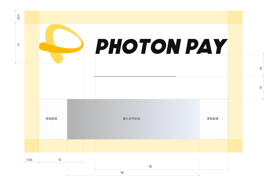
Minimum Size
Print Media: To ensure legibility, the logo should not be reproduced smaller than 0.7mm (h) x 6mm (w).
Digital Media: For optimal screen display, the minimum size is 8.4px (h) x 72px (w).
Print Media: To ensure legibility, the logo should not be reproduced smaller than 0.7mm (h) x 6mm (w).
Digital Media: For optimal screen display, the minimum size is 8.4px (h) x 72px (w).
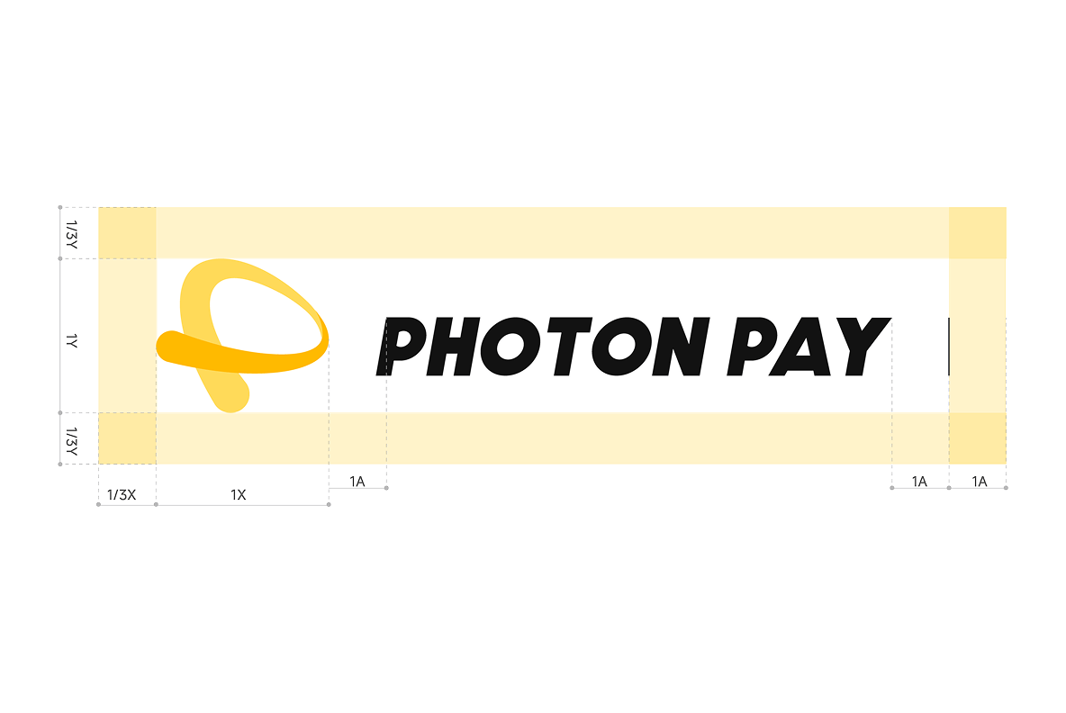
To preserve the logo’s impact, maintain a minimum clear space of 1/3 of its height on all sides. This area must remain free of any other visual elements, text, or graphics.
PhotonPay Yellow is the cornerstone of our visual identity. It symbolizes the warmth of human connection and the energy of seamless global payments. We use this palette to build a recognizable environment of trust and optimism for our users worldwide.
#FFFFFF
CMYK: C:0 M:0 Y:0 K:0
#000000
CMYK: C:93 M:88 Y:89 K:80
#FFCD29
CMYK: C:4 M:25 Y:84 K:0PANTONE: 123 C
#E4E5F6
CMYK: C:2 M:35 Y:90 K:0PANTONE: 7443 C
#5555F0
CMYK: C:2 M:35 Y:90 K:0PANTONE: 2736 C


Please ensure the PhotonPay logo is displayed in its entirety and maintains high visibility. We recommend using the primary logo lockup on a clean background for maximum impact.


PhotonPay dedicates substantial resources to the development and protection of its intellectual property. In addition to securing our trademarks and logos globally, we actively enforce our rights against any unauthorized use or misuse of our brand assets.
We reserve the right to revoke permission to use PhotonPay’s trademarks at any time. Furthermore, PhotonPay maintains the absolute right to withhold approval of any content or implementation deemed inconsistent with our brand values or global identity.

PHOTON DANCE FINTECH UK LIMITED is a company authorized to provide payment services as an Authorised Payment Institution, approved by the UK Financial Conduct Authority (FCA) under firm reference number 801082.